Strategic launch of single sign-on to facilitate growth and acquisition
Team
UX designers, agile development team, product leadership.
Role
UX/UI designer
Tools
Stakeholder interviews, MVP & target mapping, user research, product design
Duration
9 weeks
Business case
The opportunity for this project stemmed from the imperative need to harmonize workflows across various water quality applications. As we integrated multiple new products into our portfolio, several challenges became evident:
1
Acquisition of multiple products.
2
Increasing customer visisbility to additional software.
3
Increased usage of multiple product families simultaneously.
4
Dissatisfaction with cross-app workflows and overloaded customer support.
Project mission
How can we provide water quality specialists a gateway to access a comprehensive portfolio of projects and services through a single touch?
Stakeholder interviews
Understanding the project's scope required gathering insights from key stakeholders across the organization:
Development team leads
Clarified technological constrains
Sales
Introduced us to target market segments
UX Designers
Advocated for user needs and pain points
Project Managers
Emphasized business requirements and future goals
Landing on a persona
After conducting a series of user interviews, we identified a target user persona.
Rosa, manager at multiple water facilities:
Pain points
Budget overruns, staff safety, software reliability, low technology saviness.
Goals
Ensure facilities run smoothly, monitor activities through the software.
Qualitative data - key to success
After conducting six target customer interviews, we achieved a 90% accuracy rate in feedback, providing us with a high level of confidence in our next steps.
User pain points
No time to trial new software
End users lacked the time to trial new software due to the complex setup and learning process.
Absence of a unified and visually appealing interface
Similar workflows required different steps to perform.
Poor connection with customer support
Current customer support system was not acessible to end users.
Benchmarking
To guide our design sprint, we benchmarked major competitors and identified inspiring business models.

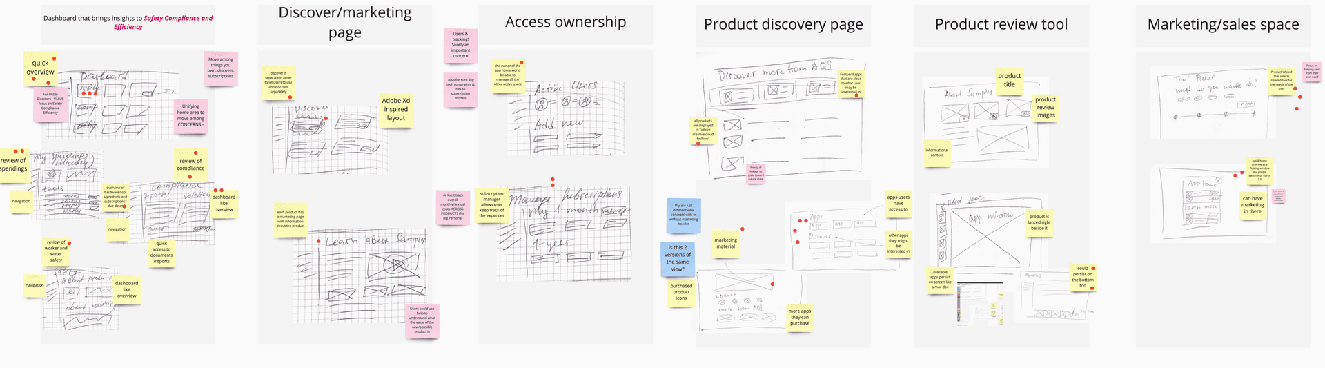
Collaborative wire-framing
Our team engaged in collaborative wireframing sessions, enabling each member to present their vision of a single home for multiple product families.

MVP user flow
While focusing on delivering the MVP, we maintained sight of the target development:
Trade-offs
Incorporating design thinking exercises facilitated the negotiation of the MVP by aligning it with user needs.
Unified, not uniform UI
We recognized that achieving a uniform user interface across different technologies and data architectures was more complex than dealing with design debt.
Newest technology is a determening success factor
The success of the project hinged on embracing the most recent component library utilized by the development team. This modernized the look and feel of the single home.
Supporting major contracts first
Due to limited team availability, the decision was made to prioritize support for major application user bases, followed by smaller user groups.
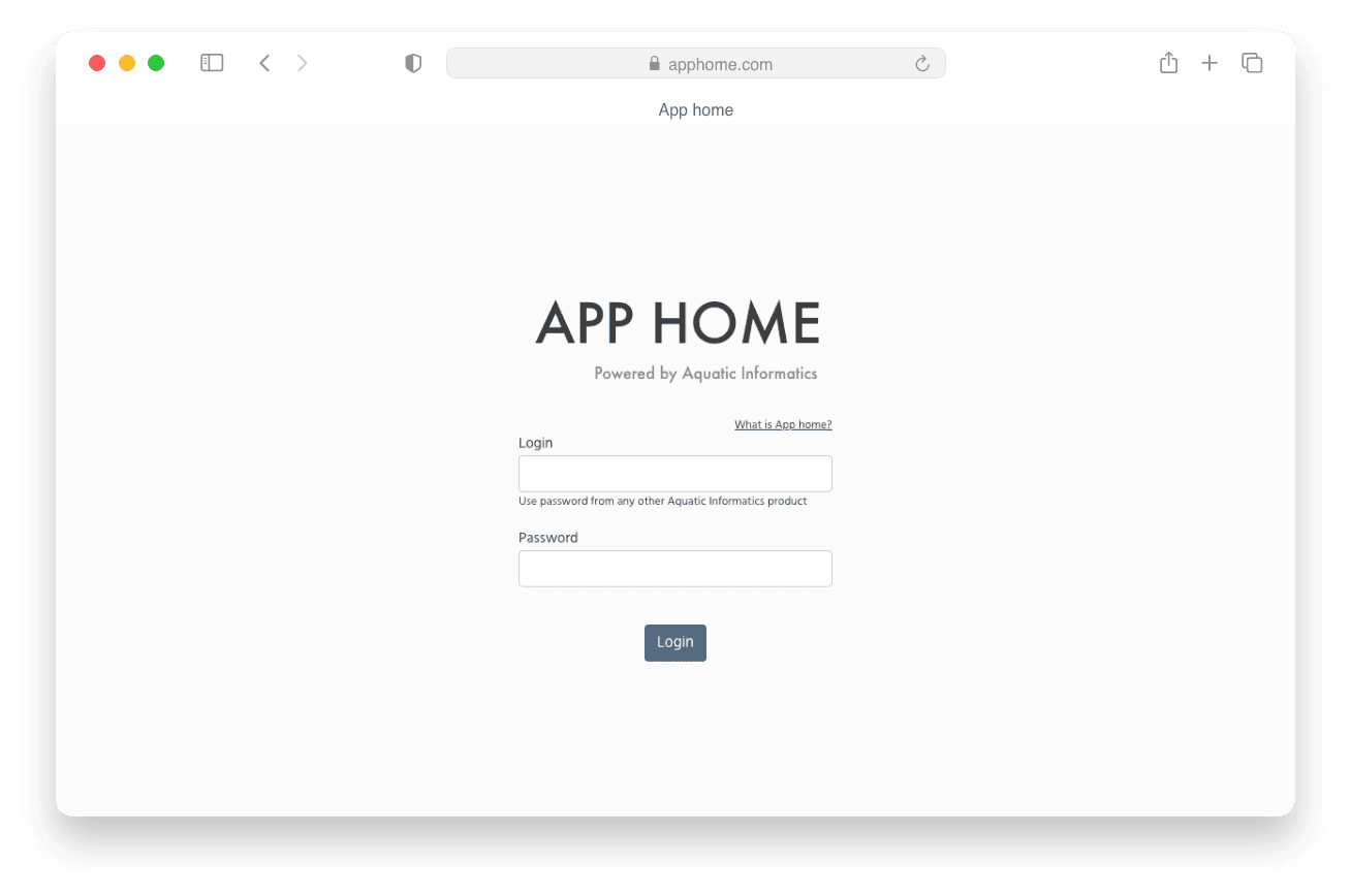
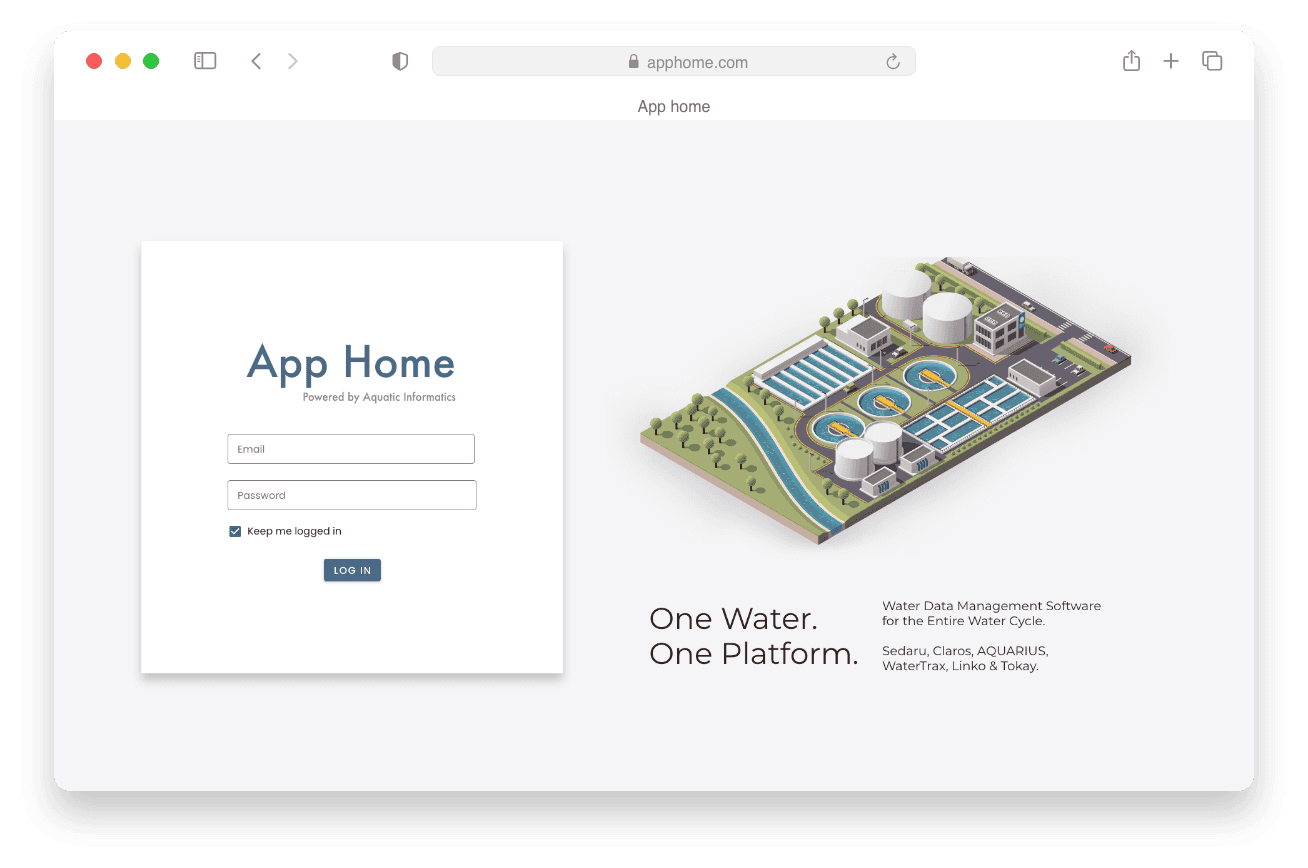
Iterating on design
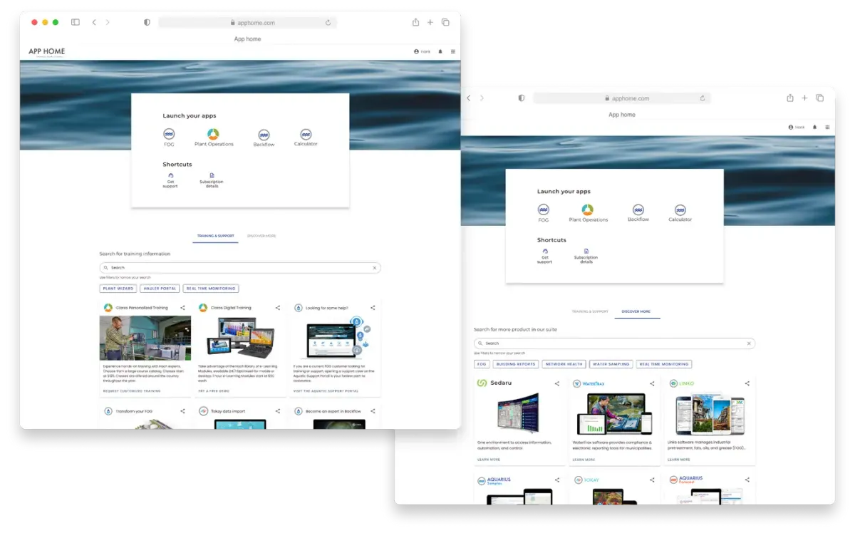
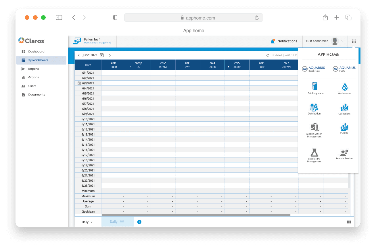
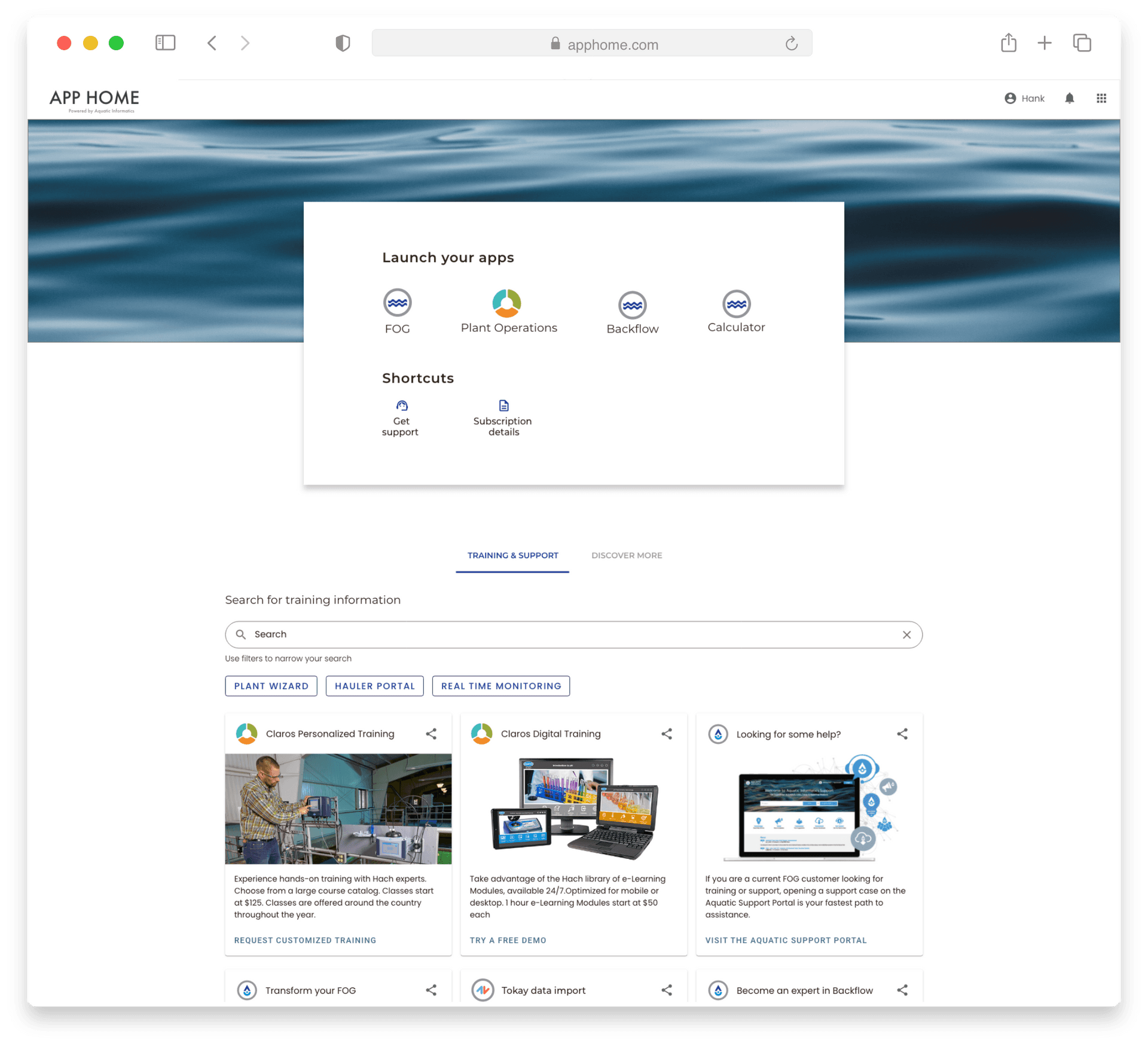
Sign in
Home

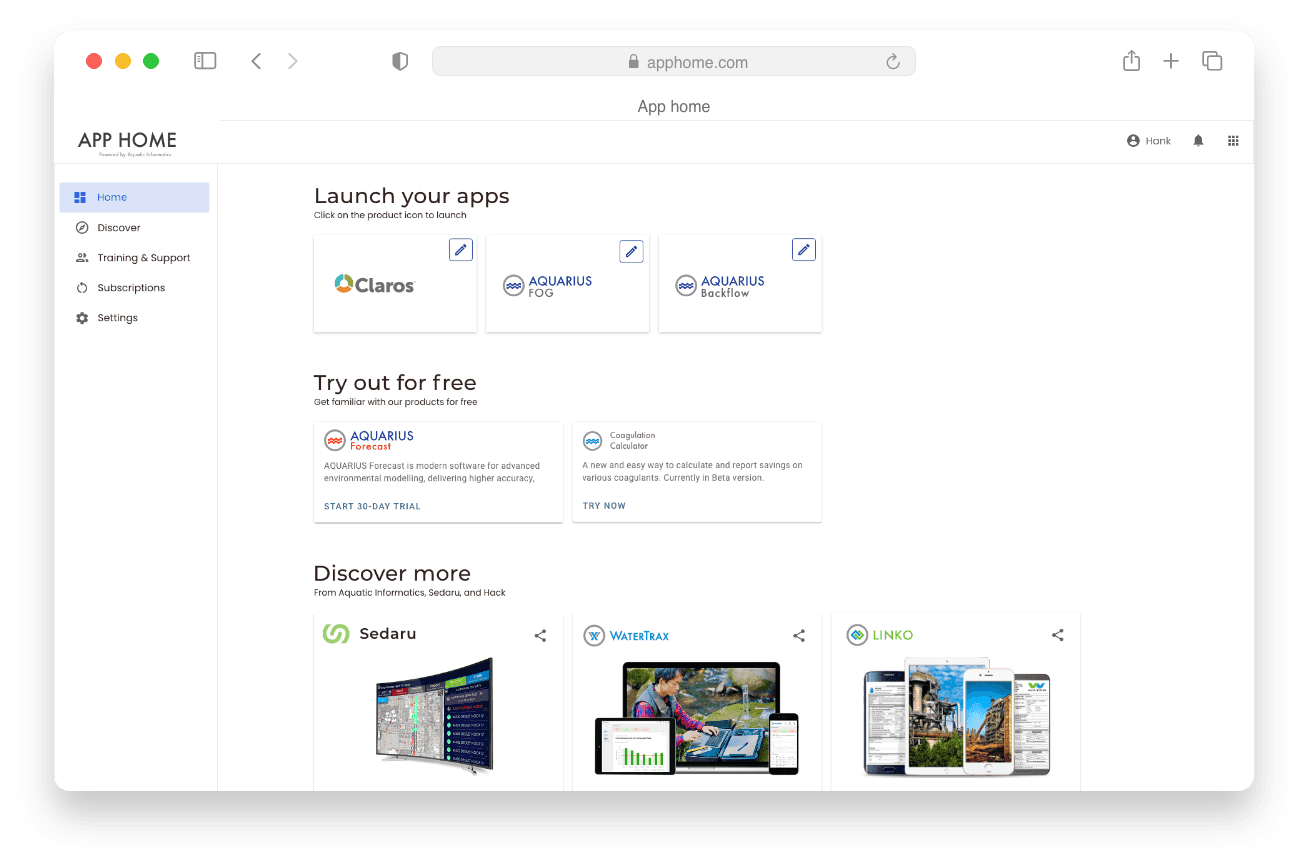
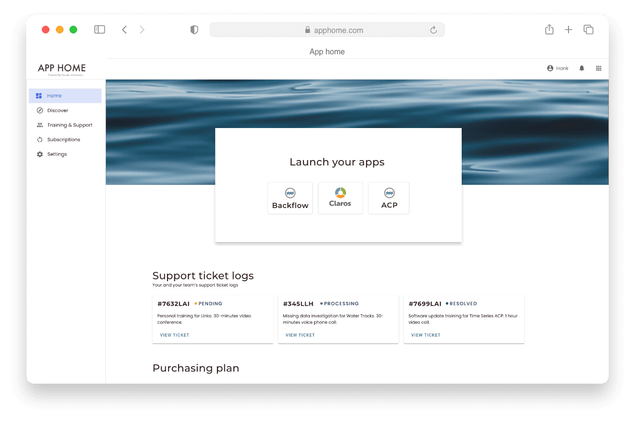
Discover
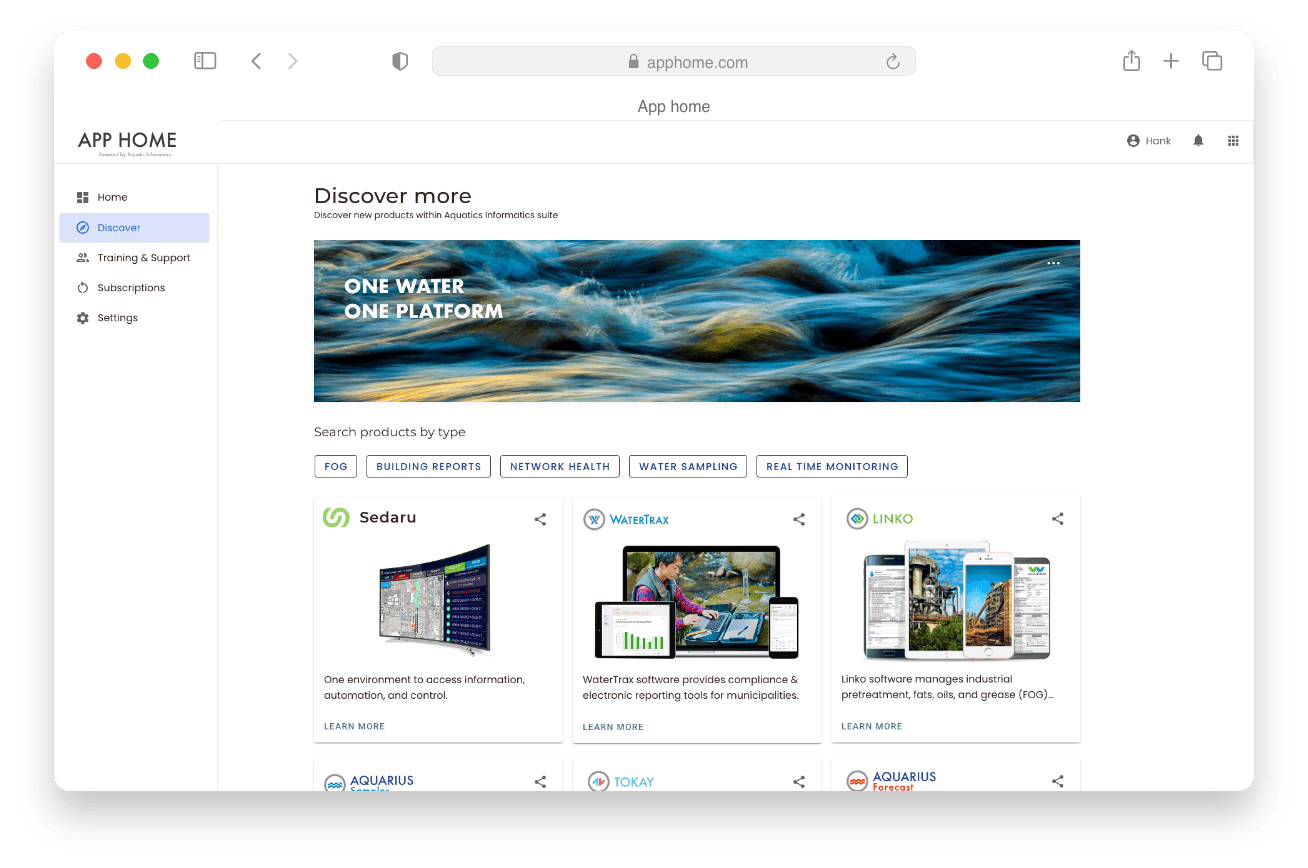
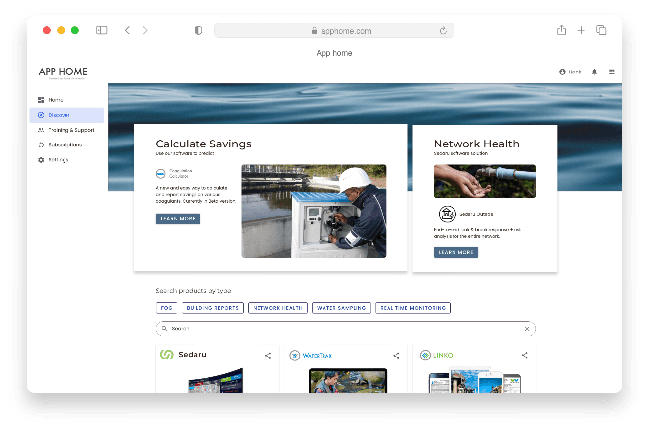
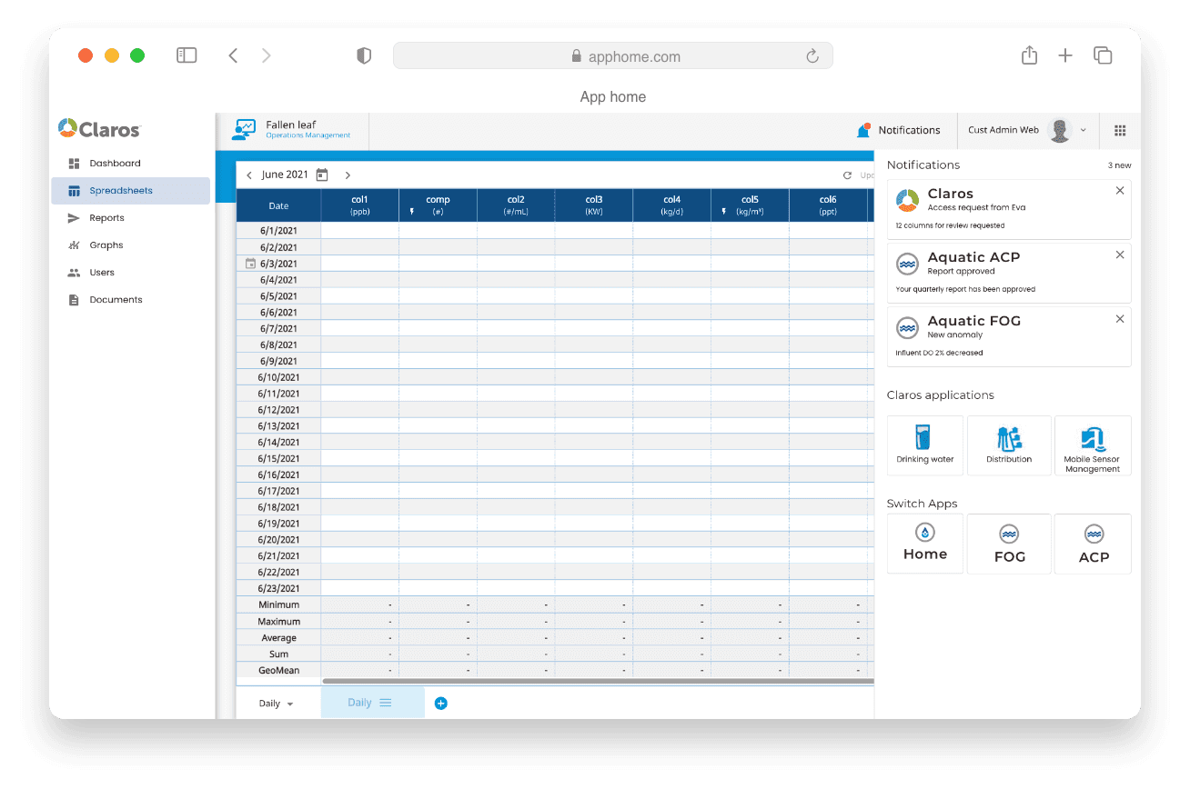
Cross-app navigation
Success metrics
Single touchpoint
A single digital touchpoint now connects all water quality products and services, including training and support.
Cross-app collaboration
Increased cross-app collaboration among major user groups during workday hours, enhancing the discovery of new workflows.
Tech debt
Anticipated reduced technical debt as more products join the water quality family.
Presented to stakeholders
Lessons learned
1.
The importance of advocating for users and amplifying their voices within a company.
2.
Learning to communicate in both business and developer languages, translating user needs into tangible business value.
3.
Growing design maturity internally and integrating user feedback into the product design process were essential for success.
Read another case study