Prototyping legacy: Figma phase
I used to spending weeks drowning in Figma—mockups bloated with dummy data, impossible to maintain, edit, or navigate. Every tweak feels like a surgery, and handing it off to anyone else? A nightmare.
Explaining ideas to developers meant rounds of revisions, breaking workflows into separate files, and untangling spaghetti logic from variables and conditionals. Even advanced features like interactions and component states were hidden in mystery layers. It's not built for serious prototypes.
We came a long way, but still...
Way before Figma, I would to rely on paper prototypes— literal sketches taped to a wall or shuffled around a table. In limited settings, they kind of worked. You could map out an experience or get quick feedback.
What about Cursor?
Just as I was ready to dive into Origami (a design editor made by Facebook, can read and display API results, has support for native iPhone functions), a new opportunity showed up. While the data team was preparing algorithms, I knew that no matter how brilliant their logic was, we’d still need to present it in a compelling, intuitive way.

I mocked up a flow in Figma to visualize the concept. I recived polite feedback—but their body language said it all. They were data people. They weren’t about to critique my font choices or spacing; they needed substance, they had to see data.
Exploring my options
I’ve also worked with Tableau, and while it was useful for quickly visualizing data, the experience often felt low-effort but also low-reward. It was great for making charts fast, but I constantly felt limited in how much I could tailor the experience to the narrative I wanted to tell. Everything looked polished on the surface, but it lacked the flexibility and depth I needed to build truly interactive, story-driven prototypes.
What if I actually build front-end for the data?
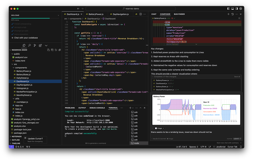
That’s when it hit me—we needed to show this model in the context of our own product, not just as a static design. A perfect excuse to try out Cursor with Claude and GPT-4o.
I jumped in, naive but excited. Very quickly, I learned:
- You need to install a few dependencies first.
- You must set proper context to get meaningful AI help.
- You actually need to understand what AI is feeding you.
- And, clicking “accept all” won’t magically solve your problems.
Downloading 23MB of data on ✨every ✨ single ✨ click
Since I never made a proper plan and was prompting Cursor to add more data vis as I was building frontend, my CSV reader service was downloading 23MB file in every function.
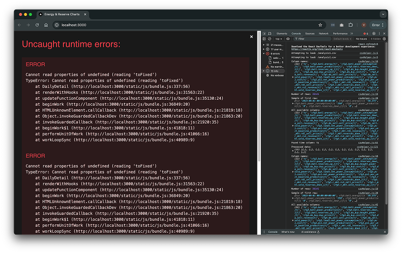
I had to refractor
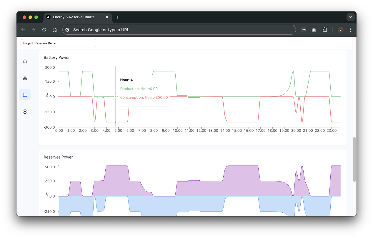
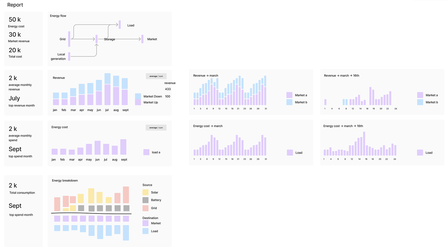
A few hours of painful refactoring and learning, polishing up the graphs, and finally—the data told a story. It wasn’t perfect, but it was real. And it was usable!
It worked!
The rest is history 🤫
Some of the awesome features I prompted my way though
- Data import service
- Recharts library integration for data vis
- MUI for buttons and icons
- A bunch of CSS styling
- Dynamic KPI cards
- Javascript functions
Lessons learned
- Make a proper engineering plan and break down components to reusable parts
- Avoid going back as much as possible, limited context window is the main disadvantage of all models today, they will just add more code and ignore current infrastructure
- Enjoy the ride! I could not believe just a day of work could get me this far.