In today’s connected world, every video call, bank transaction, or a meme travels across a complex web of networks. At the core of many of these networks lies a technology called IP-MPLS (Internet Protocol - Multiprotocol Label Switching).
It’s not something most people interact with directly, but it’s essential infrastructure—especially for telecoms, large enterprises, and critical services like utilities, transportation, or cloud data centers.
Why do we label our traffic?
Unlike the public internet, which finds the "best" path for every packet, IP-MPLS networks use a system of labels to route traffic. Think of these labels as high-speed express passes that tell each router exactly how to forward the data without re-reading the full address every time. This enables faster, more reliable performance, especially for high-priority applications like voice, video, or real-time trading.
When something goes wrong...
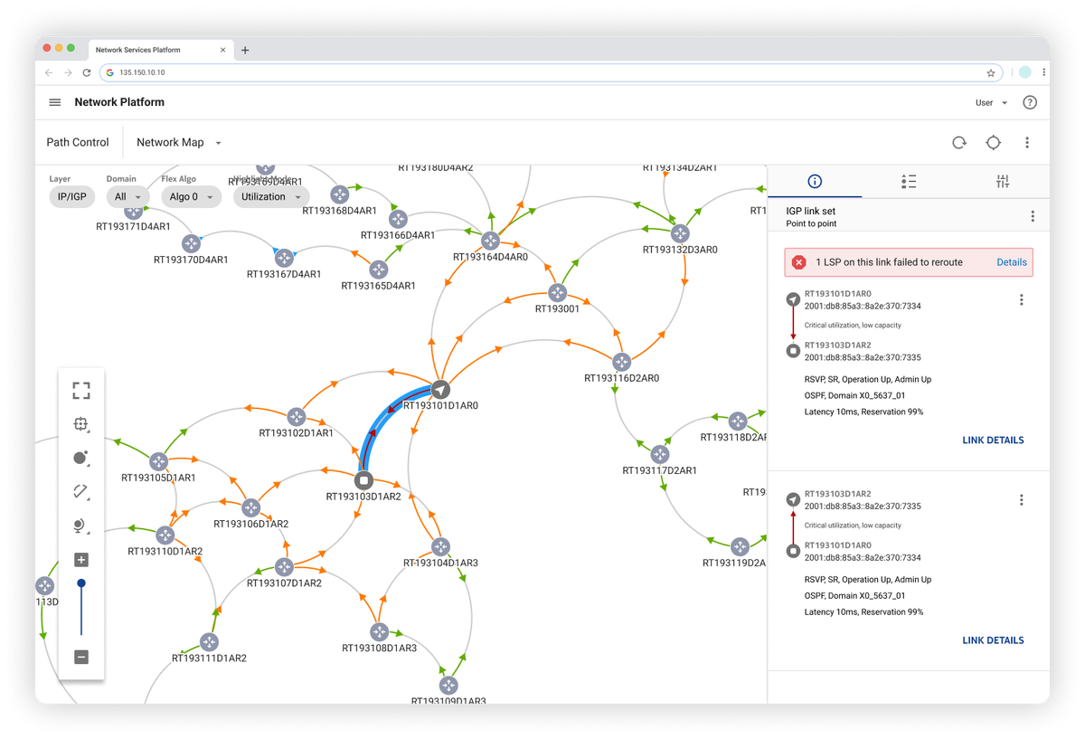
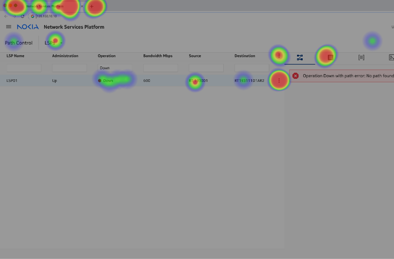
When a Label Switched Path (LSP) is down—troubleshooting becomes a maze of routes, configurations, and dependencies. For engineers, navigating this system can be slow and mentally taxing, especially under pressure.
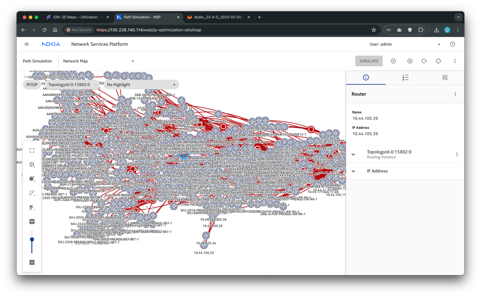
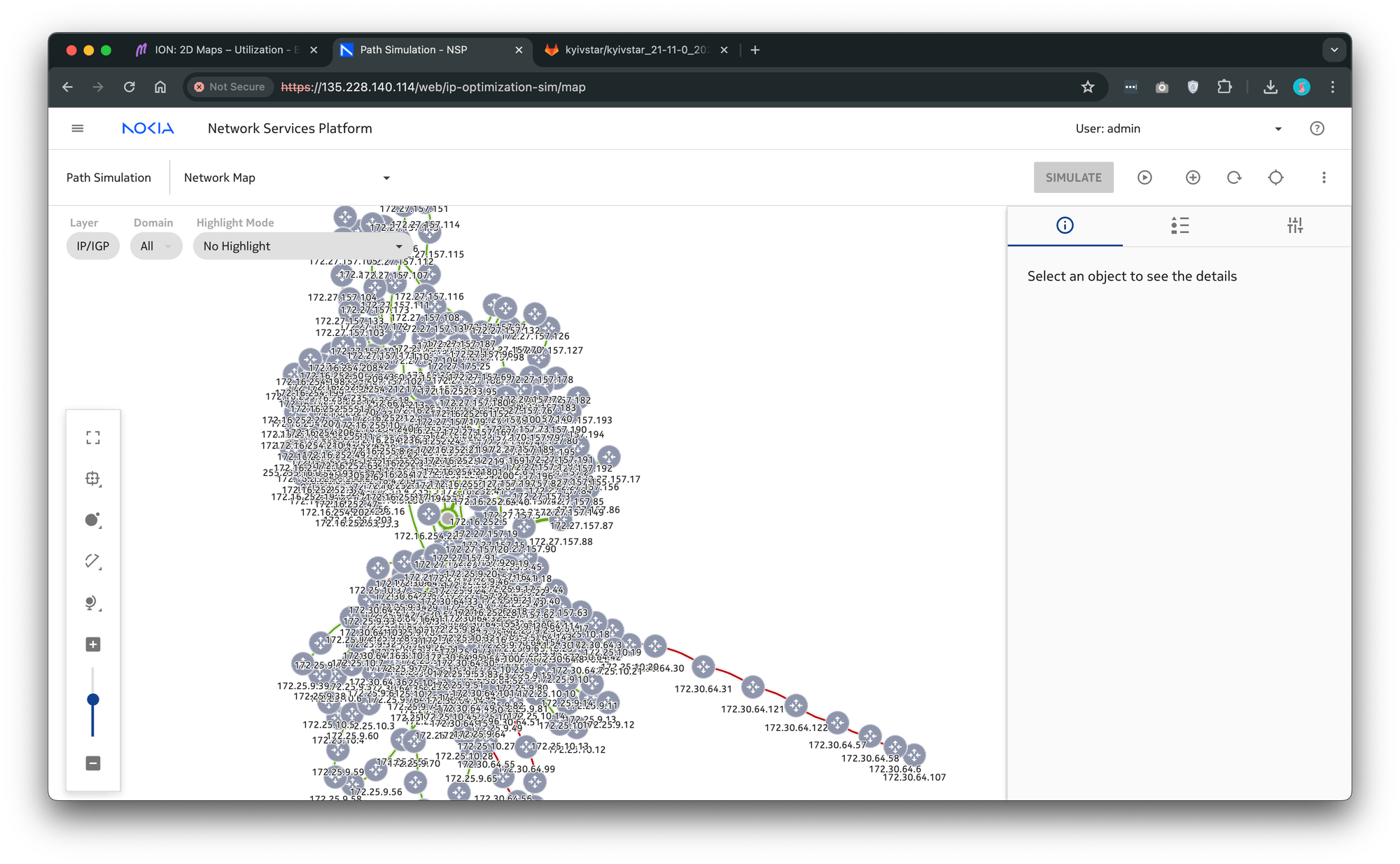
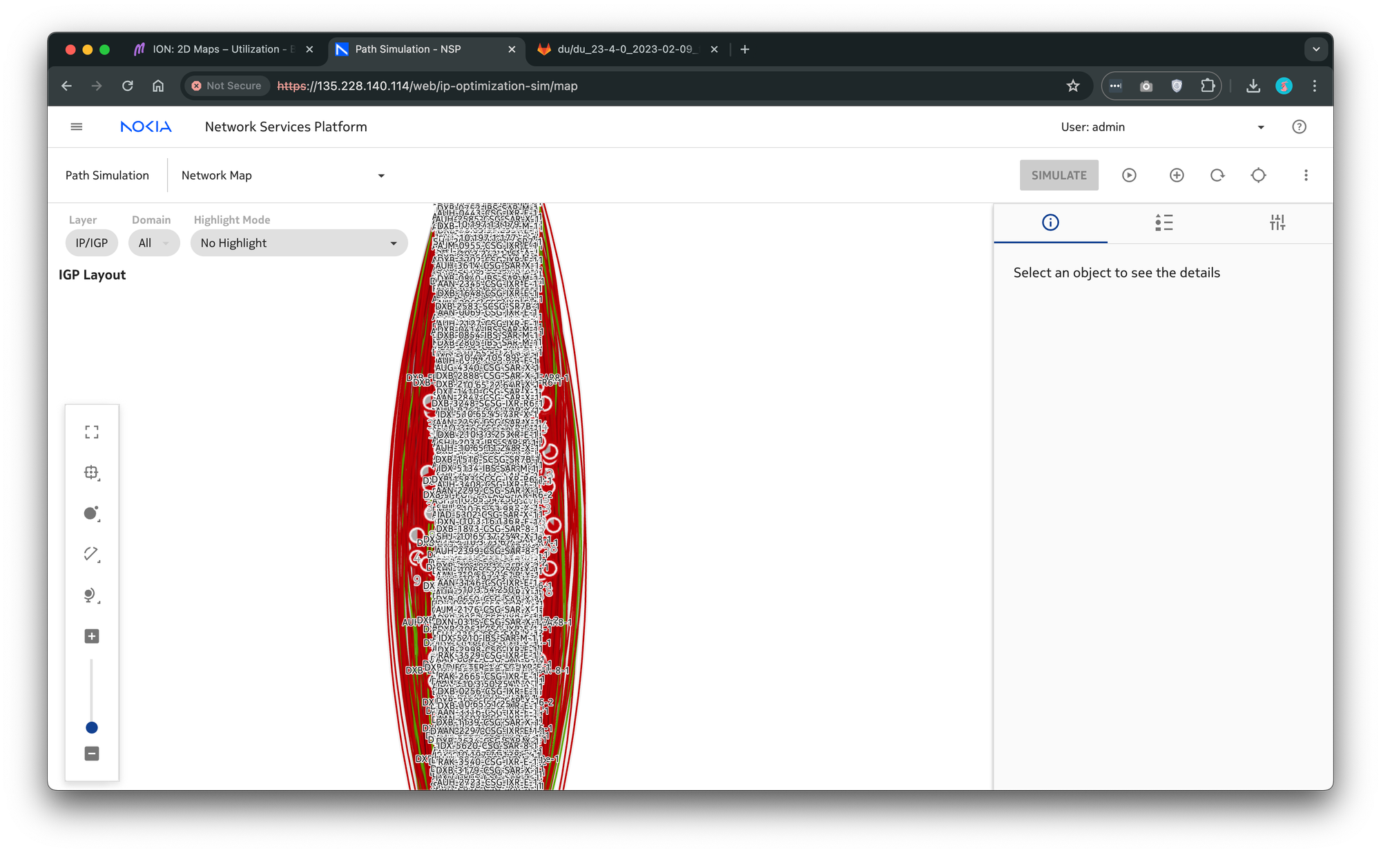
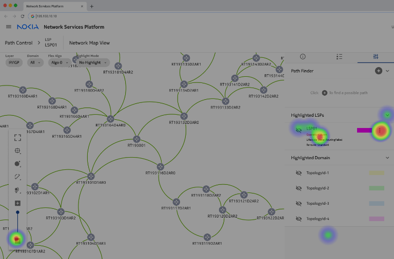
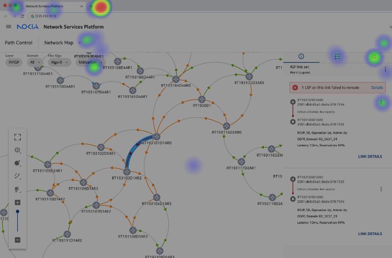
Examples of real IPM-MPLS networks. All elements are visible for dramatic effect.
Devil is in the details
Becoming a skilled network engineer doesn’t happen overnight—it takes time, hands-on experience, and a strong grasp of foundational concepts. As a UX designer working on a tool built for network professionals, I realized that to design something truly helpful, I needed to speak their language and understand their world.
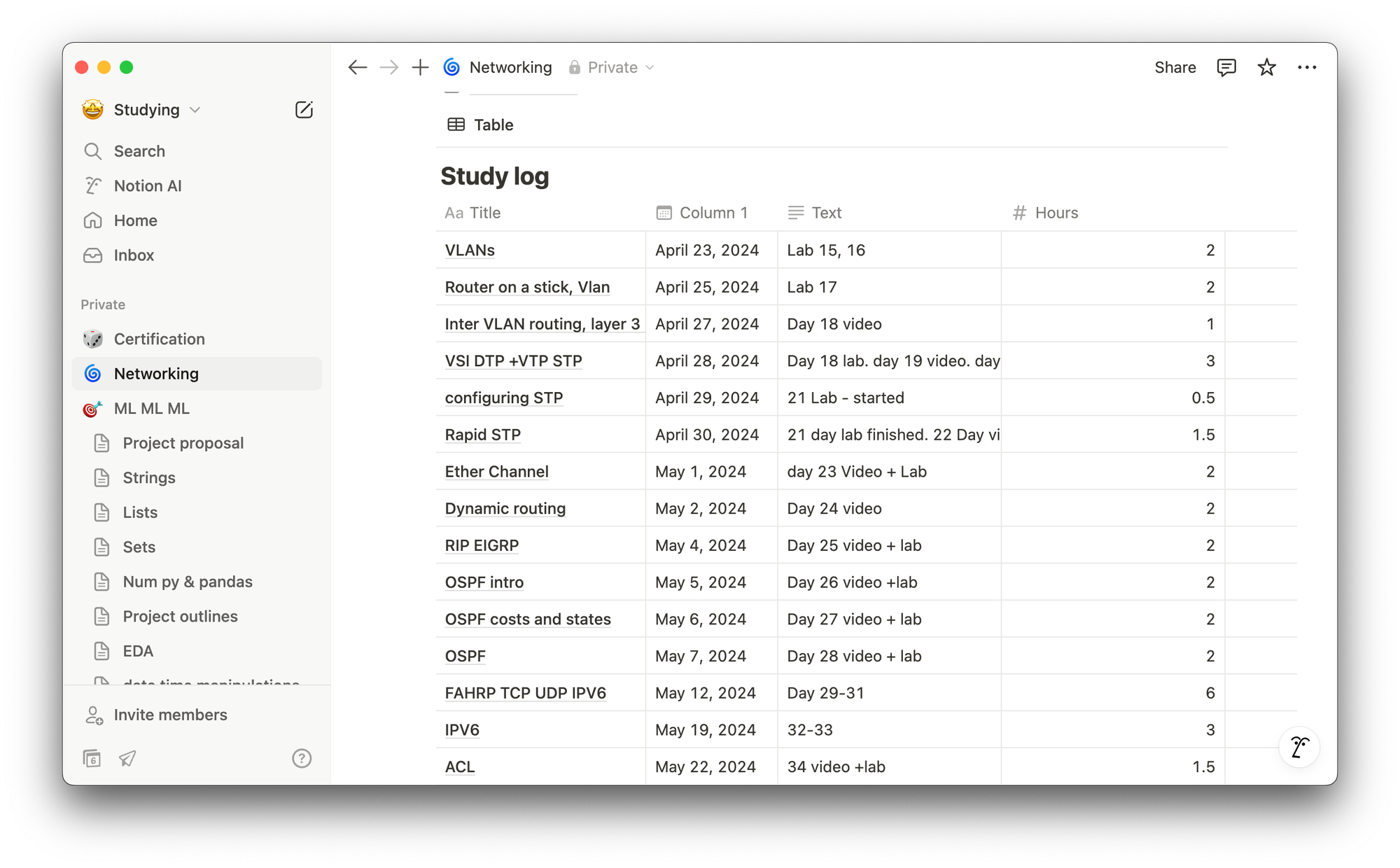
That's why I made the decision to go beyond the typical scope of a designer and took on additional training, including CCNA-level coursework in subnetting, routing. It was hard but I did it. I didn’t just want to make things look better—I wanted to design with purpose, grounded in how networks actually function.
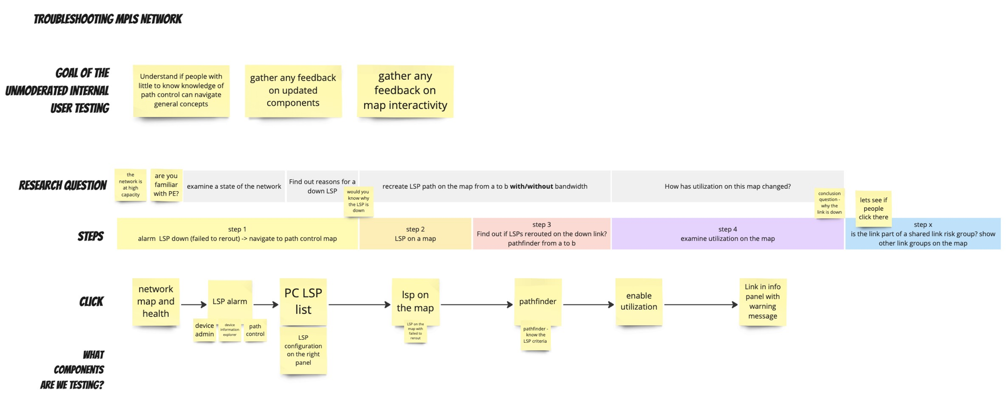
Choosing the right testing scenario
It took time to narrow down a realistic troubleshooting case that would not only resonate with experts but also push the limits of our future mapping and navigation features.
Much of the tool's functionality was driven by industry demands—support for multiple protocols, label stacks, complex routing paths. However engineers would turn the features on... and then never use them. Adoption was low, not because the features weren’t powerful, but because they didn’t fit naturally into the engineer’s troubleshooting flow.
My goal became clear: design an experience that aligned with how engineers actually work, not just what the tech stack could support.
Setting up remote study for success
Since direct access to customers wasn’t an option, I had to get creative. I took it upon myself to source participants internally, tapping into in-house experts who work closely with IP-MPLS networks every day.
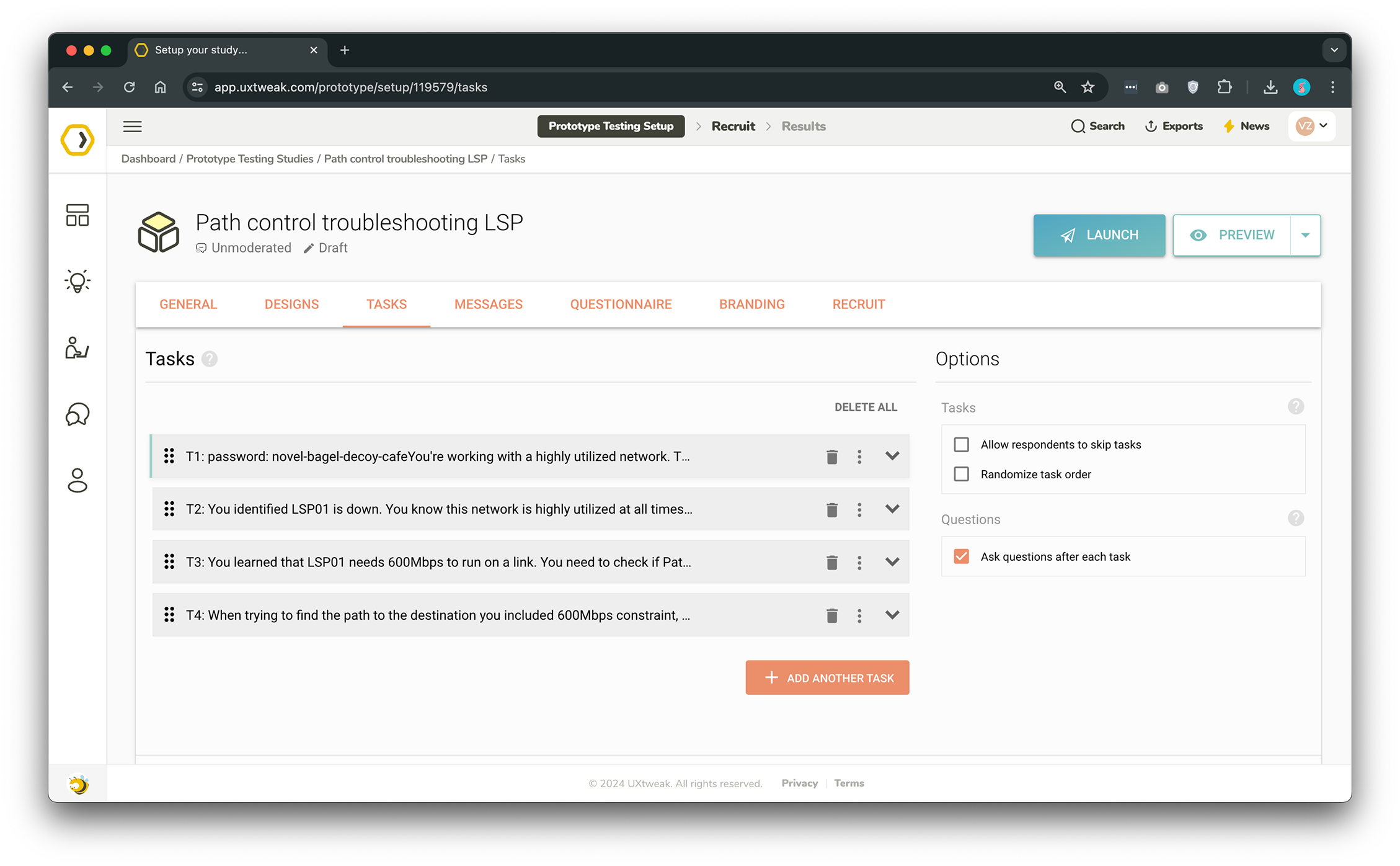
By designing a prototype that felt realistic and self-explanatory, I enabled them to walk through the experience on their own terms—and more importantly, to leave rich, asynchronous feedback without needing a formal usability session. It was a scrappy workaround, but it gave us exactly what we needed: honest insights from the people who know this domain best
The results
While this approach proved effective for testing user flows, it was less suited for gathering UI-specific feedback. Still, the experience offered unexpected value, especially for users less familiar with the domain, who were able to complete tasks with minimal guidance.
When a system failure user’s mental model kicks in
After simulating a network issue, several participants still wanted to view path criteria, hinting at a mental model that involves comparing alternate paths—particularly in failure scenarios. This suggested that automating certain tasks, like rerunning path calculations, could ease user burden and increase adoption.
Too many panels, not enough clarity
Other friction points included UI complexity—especially around the use of side panels—and inconsistent behavior when visualizing downed paths. Participants also noted difficulty in correlating alarms with the status of a path, revealing an opportunity to surface more contextual insights directly in the control interface.
Experts vs Explorers: designing for both ends of the experience spectrum
Finally, we saw a clear difference in how users navigated the tool based on their experience level: power users dove straight into diagnostics, while others relied more on data visualizations. By surfacing key indicators—like utilization and fault states—earlier in the workflow, we can better support both expert and novice users.
Lessons learned
- Intuition is everything in unmoderated testing. When you can’t guide users in real time, the prototype has to do all the talking. Every flow must feel obvious—especially for complex, technical domains like networking.
- Understanding the user’s mental model is key. Engineers don’t just want to see what went wrong—they want to understand why by comparing scenarios and diving into path-level details. Designing with that mindset leads to better adoption.
- Feature discoverability is as important as functionality. It’s not enough to build powerful tools; they have to be findable and usable in real-world troubleshooting workflows.
- Automate where it makes sense. Repetitive manual tasks—like re-running path calculations—can be offloaded by smart defaults or contextual automation, saving time and reducing user frustration.
- Design for both pros and learners. Power users want speed and control, while newer users lean on visual cues and alarms. A good interface meets both where they are.
Cheers!